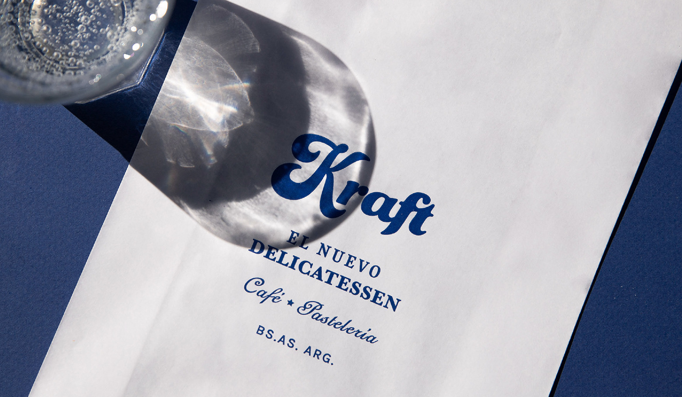
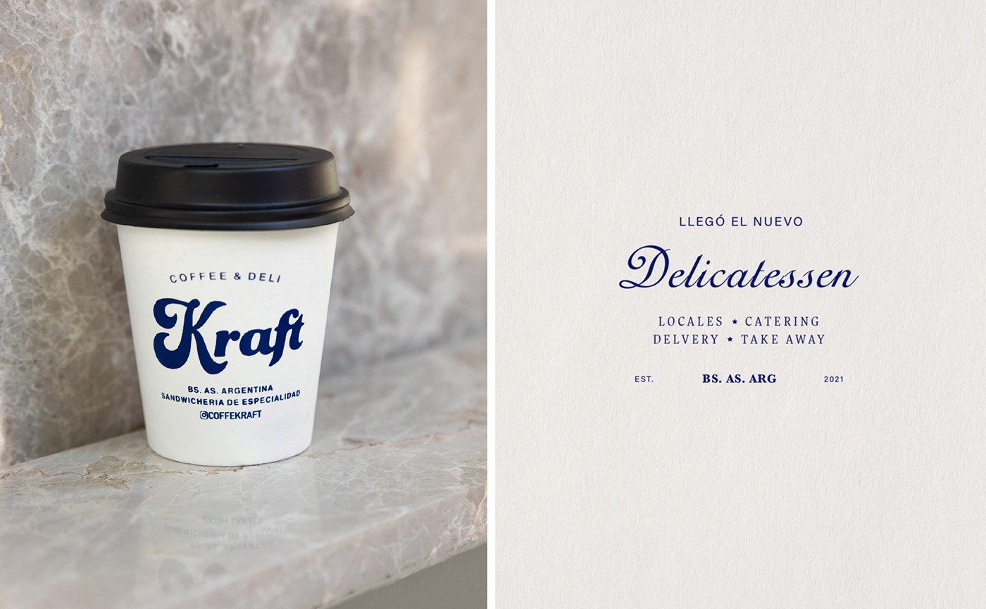

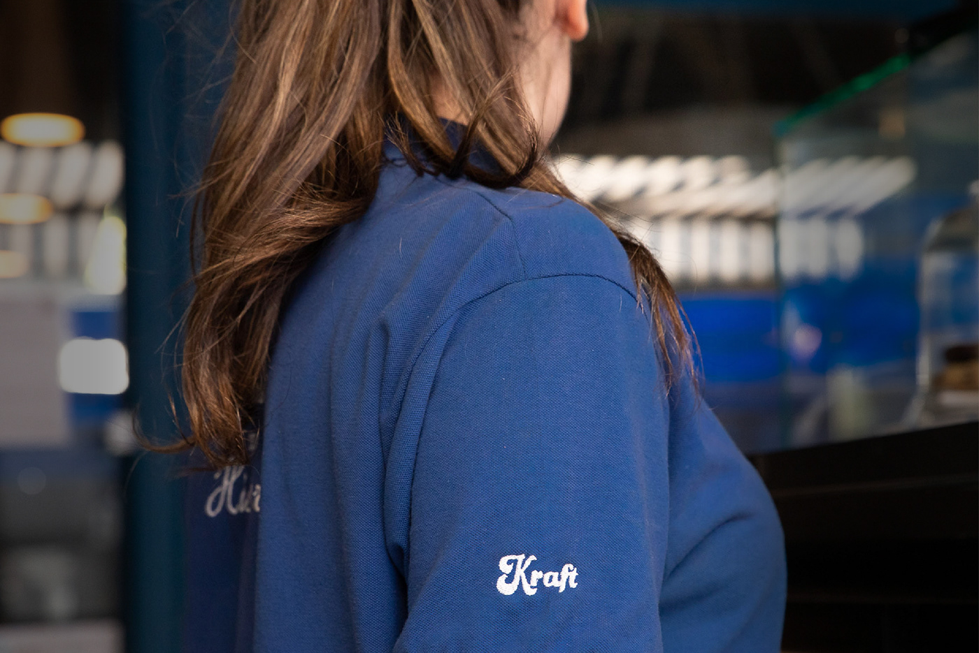
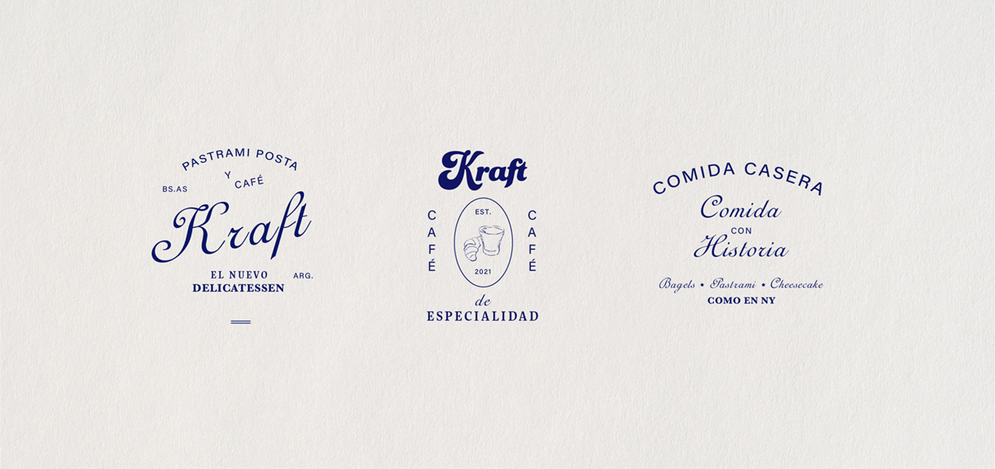


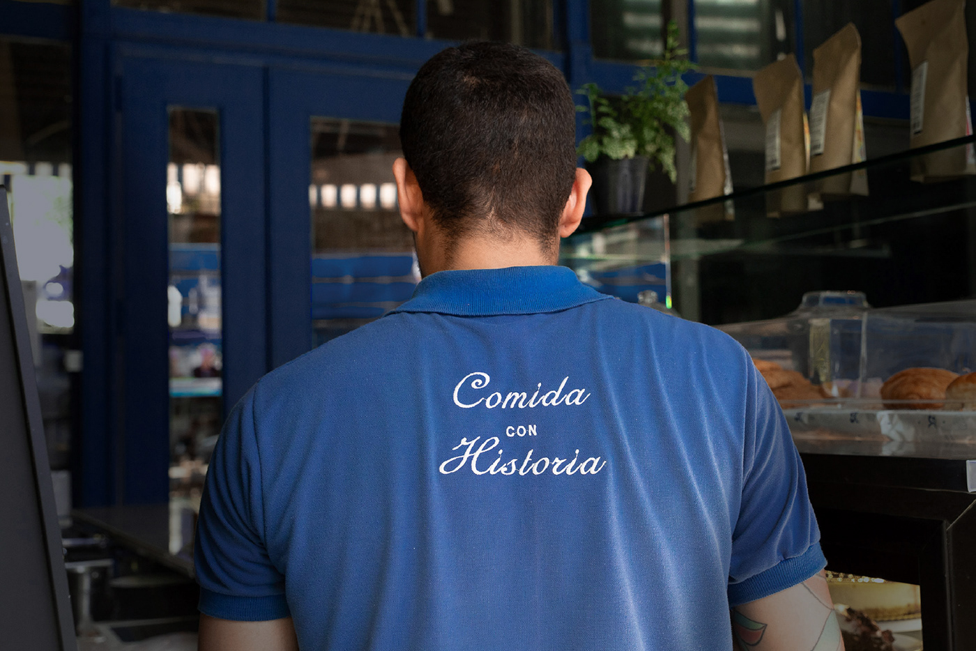
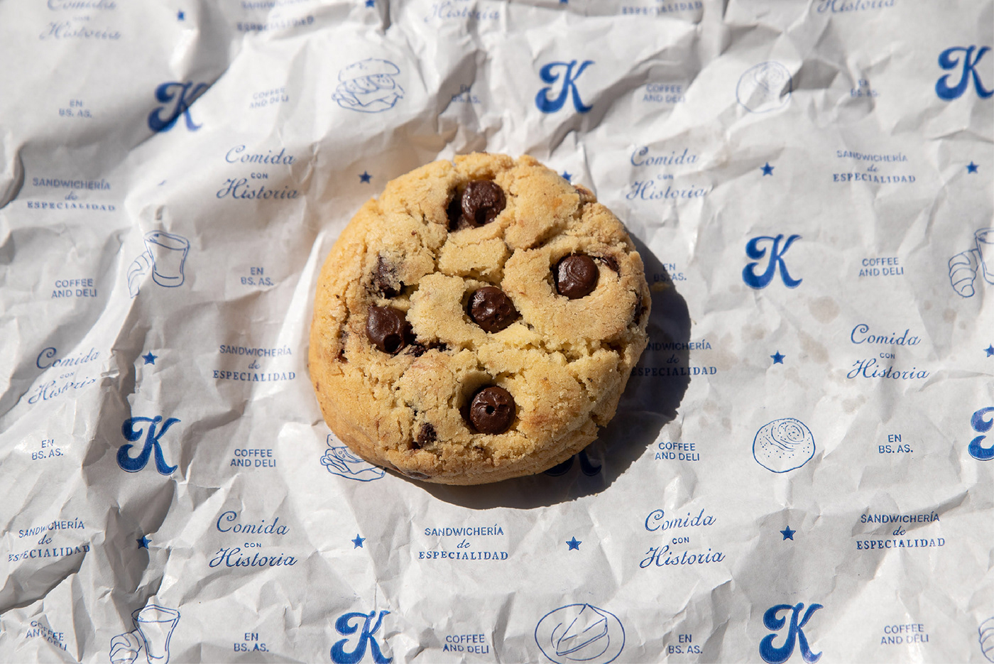
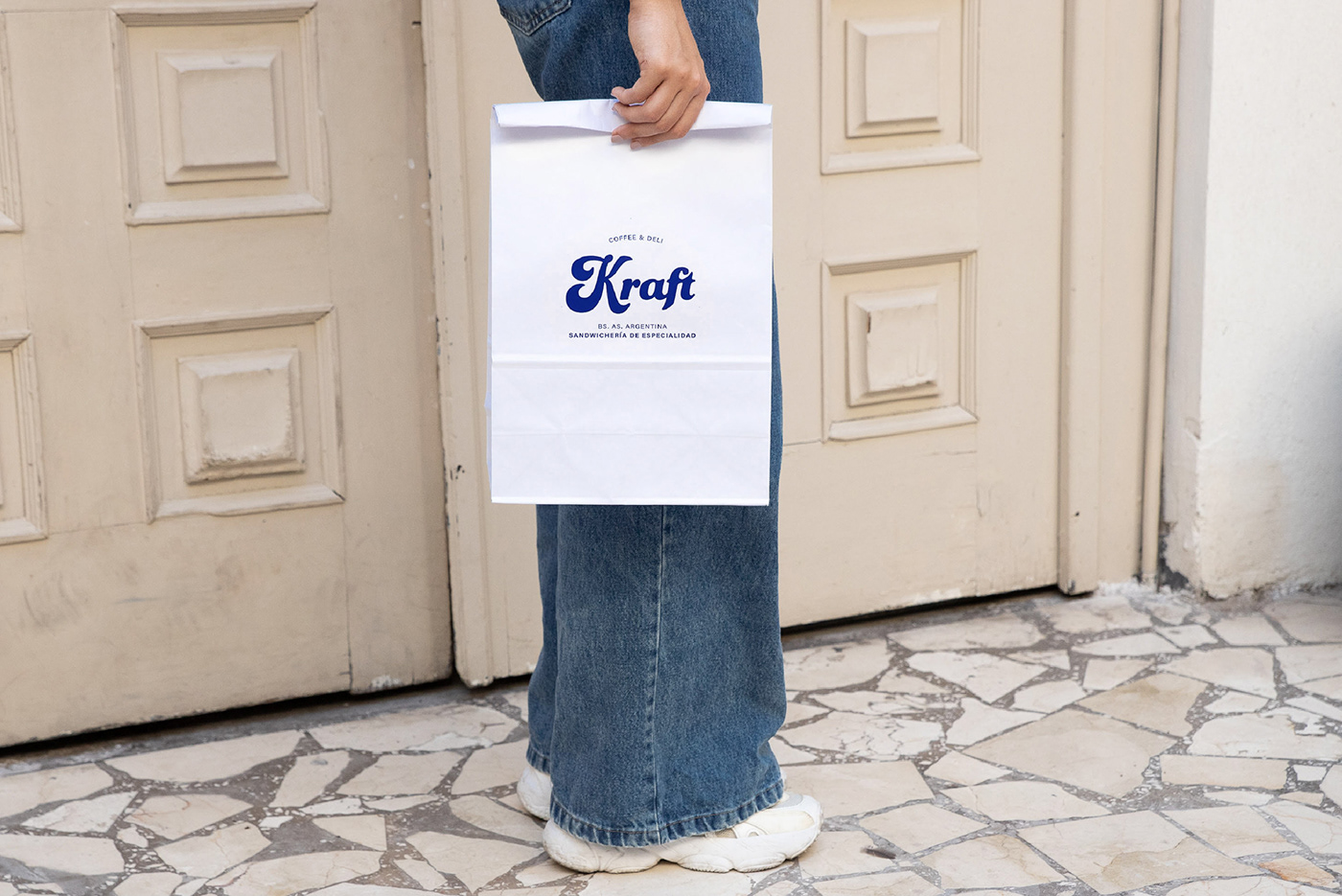
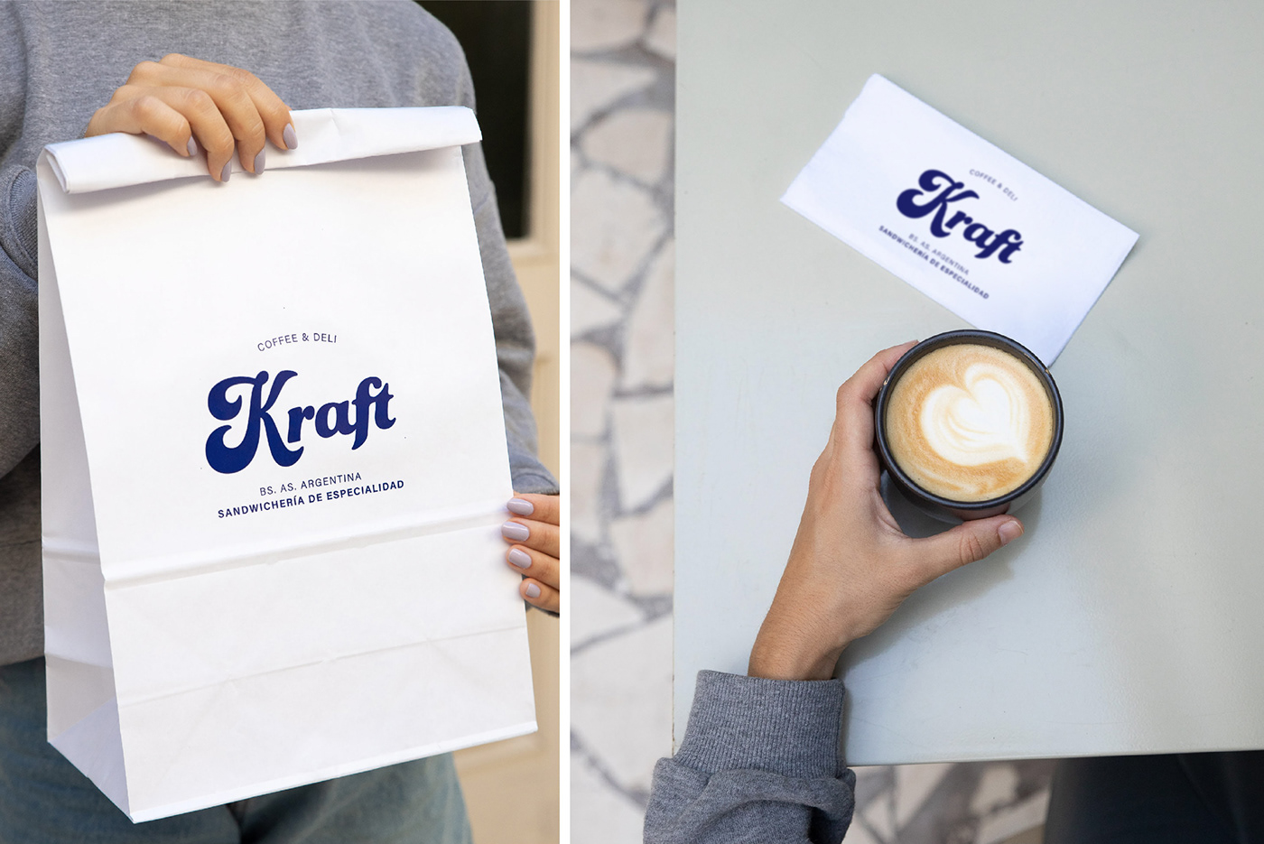
Kraft's initial idea was to merge the essence of an ancient food, the pastrami, with the new (or not so new) Buenos Aires fetish, the specialty cafeteria. Thus, the culinary tradition of Eastern Europe, transmuted through its passage through North America (especially NYC), converges with the local trend. Based on these concepts, we created the visual identity, the brand phrases and the tone of voice, the latter built around the idea of “Food with History”. Throughout the creation of the brand, the culinary proposal was redefined, becoming less specific and somewhat relegating the place of the pastrami, but the identity maintained its initial base, with very particular resources, some a bit nostalgic (such as the inspiration on New York City delis), and other more current ones such as the use of a single and vibrant color that unifies the graphic system.
__
Creative Direction: Manuela Ventura & Melisa Rivas
Design: Nicole Kupczok, Manuela Ventura, Melisa Rivas
Photography: Malena Fradkin
Architecture: AWA Art Walls Architecture


